World Trade Center Digital Directory OS
At Westfield, we initiated the development of a state-of-the-art Digital Directory for a new retail complex at the World Trade Center (WTC) and various mall locations in the US, UK, and Australia. The Westfield "visitor ecosystem" at WTC includes multiple touch points, such as digital directories, a mobile website, mobile applications (iOS/Android), physical signage, and on-site concierge services.
As the lead designer, I was responsible for the entire design process, including UX, UI, and navigation, from conceptualization to the creation of refined visual designs across all channels. I also oversaw and conducted research studies to ensure the development of a flexible system that worked seamlessly on both desktop and mobile platforms, providing a highly accessible navigation experience for shopping center visitors.
The Challenge
After interviewing shoppers and observing their experiences, we found a key issue: guests struggle to find and navigate to stores. Many rely on the printed directory for help, but poor signage makes it hard to know where to start, understand the floor layout, or find elevators and restrooms. Our goal was to develop a simple and effective system to enhance navigation for shopping center visitors.

The current digital directories in shopping centers were difficult to use. We aimed to create an experience for a wide range of international visitors who often visit these centers in tourist areas. The solution had to be simple and easy for all to understand.

Inspired by the sleek in-seat displays of luxury brands like Virgin Airlines, we aimed to design a clear and easy-to-use interface that adjusts to various formats and showcases Westfield's brand values. An analysis of mall directories highlighted the need for both vertical and horizontal options.
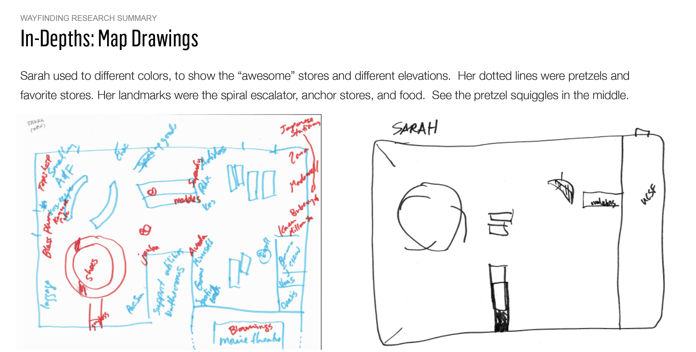
Generative research
To understand the specific needs of way-finding in complex multi-level shopping centers, we conducted generative research focusing on mapping user experiences. This research led us to discover the importance of landmarks, such as anchor stores, bathrooms, escalators, elevators, nearby transportation, and street names, as crucial directional references aiding spatial recall. Most Westfield centers are strategically located near major transportation hubs and main streets, which are familiar to frequent visitors. By expanding the map to include nearby city landmarks, we witnessed a marked improvement in wayfinding during intercept interviews with guests. Further research revealed that the shopping center visit is a multi-sensory experience, with guests utilizing smell, sight, and sound to navigate and find their destinations.
.

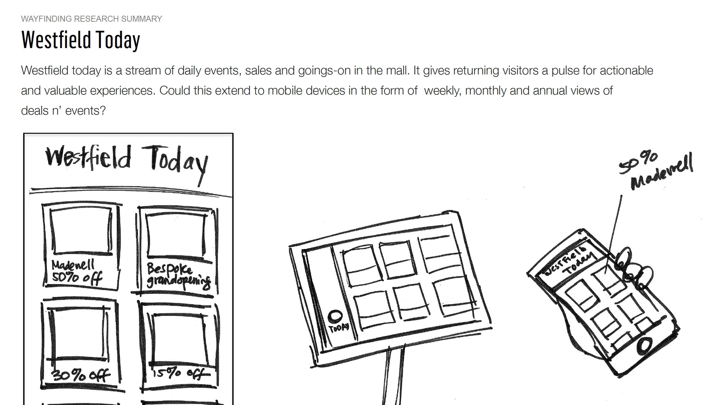
New Opportunities
Participants noted that sales, special offers, and small events (like a new pretzel flavor launch) made them spend more time at the shopping center and encouraged them to return. From this feedback, we found several main uses for the digital directory:
Search for a list of stores
Search for a list of restaurants
Get directions from the current location to a selected destination
Find the nearest bathroom
Enable Accessibility Mode
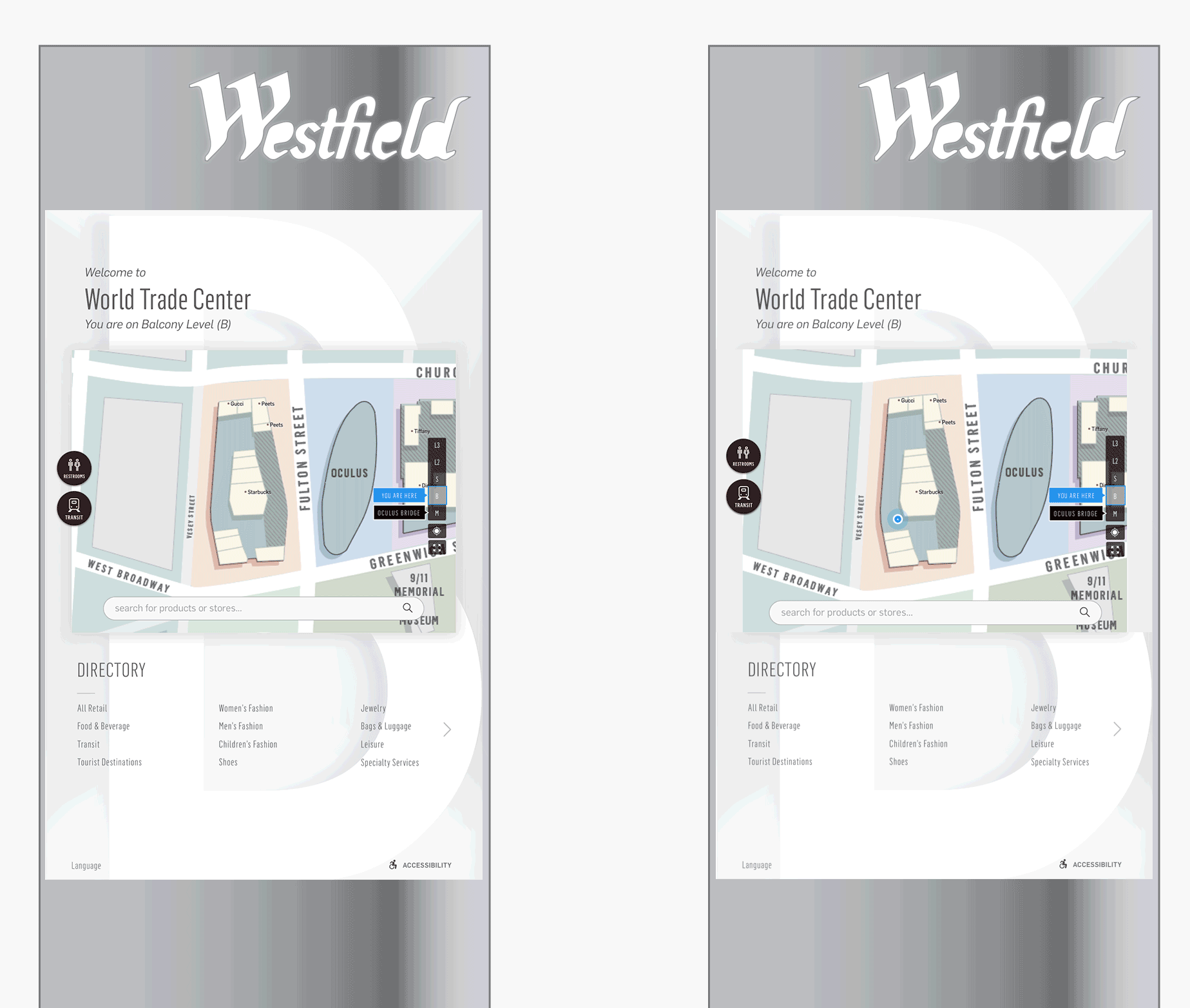
Use the map interface to locate their current position
Choose from eleven languages
Discover current events at the location

Our Solution:
Our solution aimed to meet the diverse needs of shopping center guests, including international travelers and non-English speakers visiting our malls in bustling urban centers. The user interface was designed to be highly accessible, adaptable to indoor and outdoor contexts, and capable of blending seamlessly with variable lighting situations and the environment.


An Iterative Approach:
We adopted an iterative approach, starting with rapid design prototypes and employing RITE (Rapid Iterative Testing and Evaluation) to inform UI improvements.
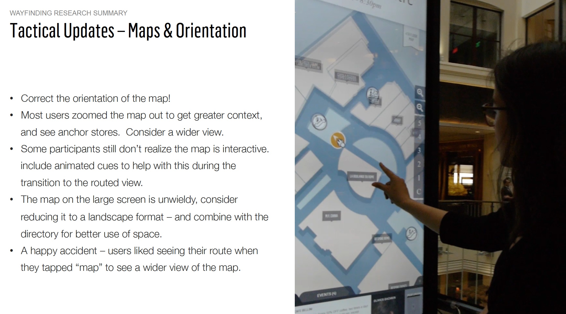
We gathered a team from product, tech, and design to run experiments and research with guests in our shopping centers. We used InVision and quick prototypes based on real data. After each study, I collaborated with engineers to apply suggested UI changes. We set up a 4K display and tablet near printed directories in our malls for testing and recruited participants on the spot, offering gift cards as incentives.


An interaction model for large displays and kiosks.
Our original assumptions about how people would engage with large screens was challenged by ergonomic needs and field of view. Through a process of testing with real shoppers in the mall, we discovered new insights about how people would engage with screens of larger scale.
We worked with the Port Authority of New York City to display our user interface using InVision prototypes. This helped us share our plans to add subway access points and schedules for the World Trade Center. With over 14 directories at the WTC, our solution offered users accurate navigation based on their current location.
Accessibility
Our system, which includes mobile, browser, and kiosk platforms, focused on accessibility for a great user experience. We added an accessibility mode on the kiosk that users can easily reach at the bottom right of the screen. This mode lets users change the UI height to fit their needs for better usability and comfort. To promote inclusive design, we used a wheelchair in our office testing to ensure it was easy to use while seated. When setting up the displays, we also paid attention to their placement to allow enough clear space for wheelchair movement, creating a smooth experience for all users.

Pictograms were repeatedly tested for legibility with and without labels, however labels and language controls were included in the final execution to maximize accessibility.

To solve the problem of long lines at one directory, we added two displays side by side. This setup was designed to reduce crowding and make it easier for users to find their way. Our choice was based on thorough research, which showed that people often queued at single directories. By using two displays, we intended to share the traffic and offer a smoother experience for visitors.
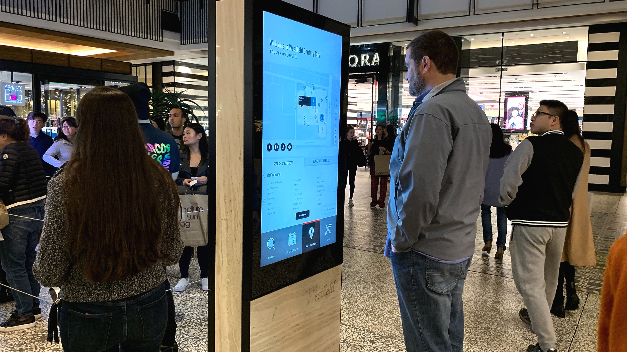
Our work led to a successful installation at the Century City shopping center in Los Angeles, California. This demonstrated how well we managed crowds and enhanced navigation for visitors.

A digital directory showing search, a map of stores and food options in a shopping center.

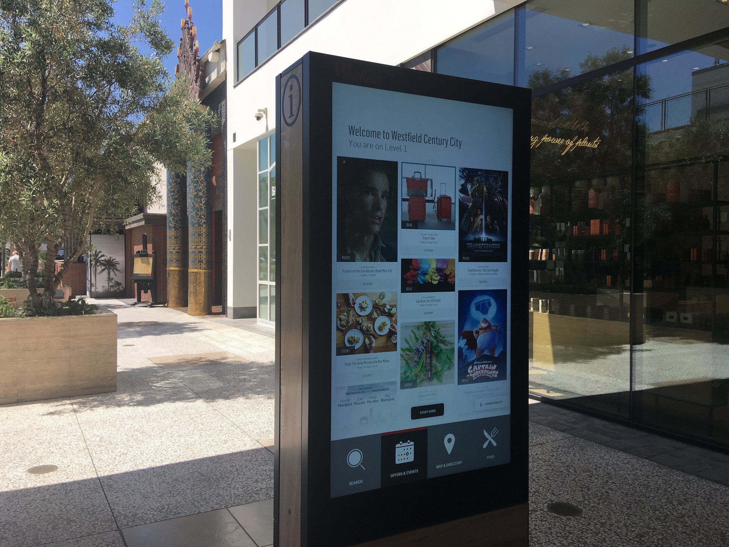
An image of an outdoor digital directors with colorful promotions for events in the shopping center, like movies and musical events.
Our research showed that guests usually paired shopping with leisure activities like snacks, movies, or massages. To meet their needs, we created a personalized feed for discovering events, movies, stores, and activities in the shopping center. We also tested our system's visibility and contrast in various settings and times. Consequently, we achieved almost 100% success in helping guests use our maps and directory to find and navigate to stores, improving their shopping experience.